When I’m trying to set a vision for a product or service, I’m reminded of this old joke:
A man finds himself lost at a crossroads in the countryside. There are no road signs, no landmarks, and no mobile phone signal. He sees an old man driving a tractor towards him over the rough ground, and he waves him over. “Can you tell me the best way to Middleton?” he asks. The old man looks around slowly and gives him a sad look. “Son,” he says, “if you’re trying to get to Middleton, you shouldn’t start here.”
We never get to start our product roadmaps in the right place. We never have the right technology, or the right skills, and we can’t be sure about the destination.
Somehow product managers are supposed to come up with a plan that takes the product from the middle of nowhere to the place that everyone wishes they could get to. That plan is the product roadmap. In this article, we look at the challenges of product roadmaps, and six steps to help you build better roadmaps to ease your project management process.
The Complete Guide to Web Design Project Management
Read our complete guide to web design project management for developers, designers, and marketers. Learn how to work with stakeholders, manage budgets, and keep your clients happy.
Learn moreHow to build a product roadmap
Where have all the good product roadmaps gone?
For me, the problem with product roadmaps is that there are so many bad examples out there that people assume that’s as good as they get.
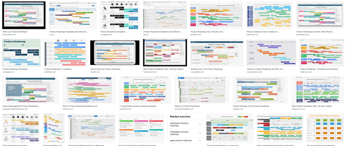
Run a Google image search for “product roadmap,” and what you’ll see are a lot of Gantt charts showing features, and their delivery dates, as horizontal bars on a timeline. The longer the bar, the longer the feature takes to deliver.

There are two things that worry me about this.
First, a product roadmap needs to be more than a backlog of features to implement. There needs to be a compelling proposition for the user.
"A product roadmap needs to be more than a backlog of features to implement. There needs to be a compelling proposition for the user."
Second, the time required to deliver a specific feature is always a guess. Which means there’s a margin of error. The further along the timeline you go, the more those errors add up. The roadmap looks like a solid, reliable plan, but it’s bound to fail.
In my experience, that’s the norm: no strategic vision, and promises that can’t be kept. So to write a better roadmap, just do the opposite. Here are six ways how.
You might also like: 10 Myths About Prototyping, Busted.
1. Have a product vision
Every map needs a destination, an “X marks the spot” that you’re trying to get to. That destination is the proposition, the story you tell your users about why this product or service is useful for them.
"Most product roadmaps aren’t the result of a clear vision. They’re the result of someone sorting a backlog of opportunities by 'ease of implementation.'"
Most product roadmaps aren’t the result of a clear vision. They’re the result of someone sorting a backlog of opportunities by “ease of implementation.” The low-hanging fruit gets prioritized. More complex ideas get put off indefinitely.
The result is not a compelling, uniquely valuable product, but a mishmash of ideas that are of moderate value and easy to copy.
If all you do is keep bolting on features to your product, then you’ll end up with something like Homer Simpson’s car.
2. Build themes
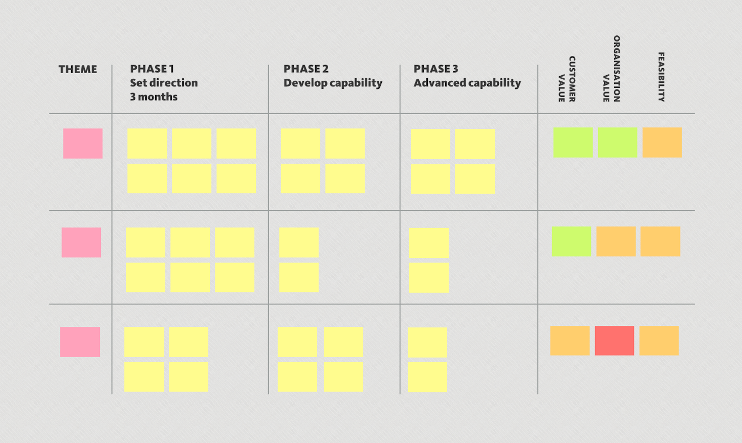
The secret is to sort your backlog of ideas into themes. Those themes start to tell the story of your product and how it will evolve over time.
You can create themes by looking at your backlog through the lens of organizational goals (such as the organization’s mission or business model), or through the lens of structural changes (regulatory, technological, and social changes). But the best way to create themes, I find, is to examine the backlog through the lens of user experience.
For instance, imagine you were creating a new camera. There are thousands of features to add or opportunities you could pursue when you’re designing it.
Some of those features will fit into a theme about offering lots of manual controls to the user—a dial to let you adjust the camera’s aperture, a setting to manage the ISO level of the sensor.
Some will be features about making the camera small enough to fit in a pocket and whether to include a retractable lens, or a viewfinder, for instance.
Of course not all themes appeal to all types of users. Professional photographers want lots of manual controls, casual photographers don’t—they’d prefer a camera that fits in your pocket.
"The themes you choose will tell a story that sets your product apart from everyone else’s."
That means you can start to prioritize your backlog based on which themes appeal to your target audience. The themes you choose will tell a story that sets your product apart from everyone else’s.
The sign of a good strategy is that it tells you what not to do. Themes help you do exactly this.

3. Embrace more prioritization
Once you’ve sorted the themes and come up with descriptive names, you can prioritize further by thinking about the value and cost of each theme.
The value to customers should be apparent from your user research. A theme might be “table stakes” (your camera has to be able to take pictures) or something that solves a significant user pain point (like rapid photos, so you never miss a shot of your child’s exploits).
Then there’s business value. A theme might make money online (the camera comes with a subscription to a cloud storage service), or differentiate the product from competitors, or even save money.
And finally, there’s feasibility. A theme may be technically or operationally easy to deliver—or there may be impossible barriers.
In the early stages of product development, you’re unlikely to have detailed answers to the questions of value and feasibility.
I’ve found a “traffic light” rating (red, amber, green) works best at this stage. No red lights means a theme is viable and worth exploring. Lots of green lights suggest a theme is high priority.
You might also like: 8 Usability Metrics Tech Teams Can Use To Analyze User Behaviour.
4. Tell the story
Themes help you tell the story of your product or service—to the users and the organization.
Often organizations are slowed down by competing agendas and confusion over priorities. When your vision is a simple, clear story, it unlocks energy and focuses it.
"When your vision is a simple, clear story, it unlocks energy and focuses it."
One travel company I worked with told me how themes made it easy for managers to explain which initiatives were being prioritized, and to elicit ideas and win buy-in for their strategy.
“We were sceptical, but it turned out to be the most valuable thing that came out of the user research,” they told me.
5. Do just enough planning

So what about the other problem with product roadmaps: the guesswork involved in planning?
This problem arises because the wider organization wants to know when a particular feature will be launched. So the roadmap becomes a list of promised features, each with a delivery date.
That’s an understandable request, but as we’ve seen, it leads to plans that are unrealistic. By demanding certainty, the organization gets a fantasy plan.
Here, the trick is to realize that you can’t plan every detail. Which leads us to the next point.
You might also like: 3 Project Management Strategies to Prevent Scope Creep.
6. Focus on opportunities, not features
First, avoid promising detailed features. Before you’ve fully investigated an opportunity, you can’t be sure that a specific feature is the right solution.
I was once given a design specification to build an online supermarket. It was a distillation of the features that were present on competitor sites—and there were a lot of features.
Fortunately, I’d already done a lot of user research in the area. I knew that most of these features (shopping lists, favorite lists, recommended items) were attempts to answer the problem: how do we help users quickly find the exact item they want from the 30,000 items on sale in our store? I also knew that none of these features was an effective solution.
Instead, I was able to demonstrate how tweaks to the existing search and browse capabilities were more effective solutions. We built those changes and delivered a better solution that grew market share at a fraction of the cost.
The moral: focus on addressing opportunities, not delivering features. It gives you more flexibility to investigate what really works.
"The moral: focus on addressing opportunities, not delivering features. It gives you more flexibility to investigate what really works."
The value of an uncertain plan
Think of a product roadmap as the path chosen by a rock climber.
The goal is the top of the cliff face. From the ground, you can judge the route that’s likely to have the best hand and foot holds. But it’s only up close that the next few hand holds can be safely identified.
Product roadmaps tell you three things:
- Where you’re trying to go
- The most likely route
- The next step
I recommend dividing your roadmap into three phases. In the first phase, you set the direction. In the second phase, you broaden capability and develop expertise. In the most distant phase, you build on what you’ve learned to deliver more advanced capability.
A product roadmap should tell you which opportunities you’re going to address in each phase. You might even go back and address the same opportunity with increasing levels of sophistication—starting with basic fixes, moving on to more customized solutions, and finally adding a sprinkling of machine learning once you’d gained a deep enough understanding.
The critical thing here is that detailed planning doesn’t belong on your roadmap. The project plans to deliver the next phase should be a separate document.
Focus and discipline: The heartbeat of a strong product roadmap
The combination of a strong vision, and a simple, adaptable plan is the essence of a good product roadmap.
The clarity that you get from a good roadmap is essential in helping teams maintain the focus and discipline they need to follow it for months or years and deliver on the vision.
The adaptability of the plan helps you maintain that sense of direction when teams encounter unexpected roadblocks. And that combination of clarity and openness makes it easier to synchronize your roadmap with other plans from across the organization.
All of that allows you to create a sense of focus and discipline. That is vital if organizations are to make the journey from the middle of nowhere to where everyone else wishes they could be.
Read more
- How to work with Metafields when building Shopify themes
- 9 Steps to Establish Strong Design Principles for Your Team
- Leading Successful Discovery Sessions: Set the Stage for Client Projects
- A Step-by-Step Guide on Building Processes to Scale your Development Agency
- Giving Feedback: What We’ve Learned About Building Strong Design and Development Teams
- A Web Designer’s Guide to Project Schedules
- How to Use a Kanban Board with Product Design Teams
What are your best tips for creating effective product roadmaps? Share your thoughts below.

