The web turned 30 in 2019. Over the last three decades it has changed our world like no other technology. It’s empowered us to build experiences we’d never have imagined. As its creator, Tim Berners-Lee, said to mark its anniversary, "The web has become a public square, a library, a doctor’s office, a shop, a school, a design studio, an office, a cinema, a bank, and so much more."
But unfortunately, a number of negative sides of the web have also developed that no one could have predicted. As always, with great power comes great responsibility—and in 2020 more designers and developers will take that to heart, and focus on fixing the web.
“We were sold on the idea that the web would bring us together,” sighs Haraldur Thorleifsson, founder and design director of full-service creative agency Ueno. “But I think it's done the opposite in many ways. We've become less connected, more isolated. We've stripped away all the emotion and focused purely on the functional aspects, and I worry that if we don't start to unwind, it will lead us down continuously worse paths. My hope is that we can add feeling back to the web and that it will start to truly deliver on the promise that got us all so excited in the early days.”
My hope is that we can add feeling back to the web and that it will start to truly deliver on the promise that got us all so excited in the early days.
For this year’s annual trends post, we explore advances in both design and development that will help build a better web—whether that’s to further creativity or implement ethics. At the same time, we look at cutting-edge technologies and processes that’ll help you build experiences that stand out and catch the attention of users in a busy, always-connected world.
We've also included our web design trend predications from 2019 at the bottom of this article, so you can see how the years compare, and how our predictions turned out. Skip ahead to read them.
1. Algorithmic design
Increasingly, design is being automated. That doesn’t mean, however, that web designers are becoming obsolete. Algorithms can help us free up some of our time, so we can spend more on being creative.
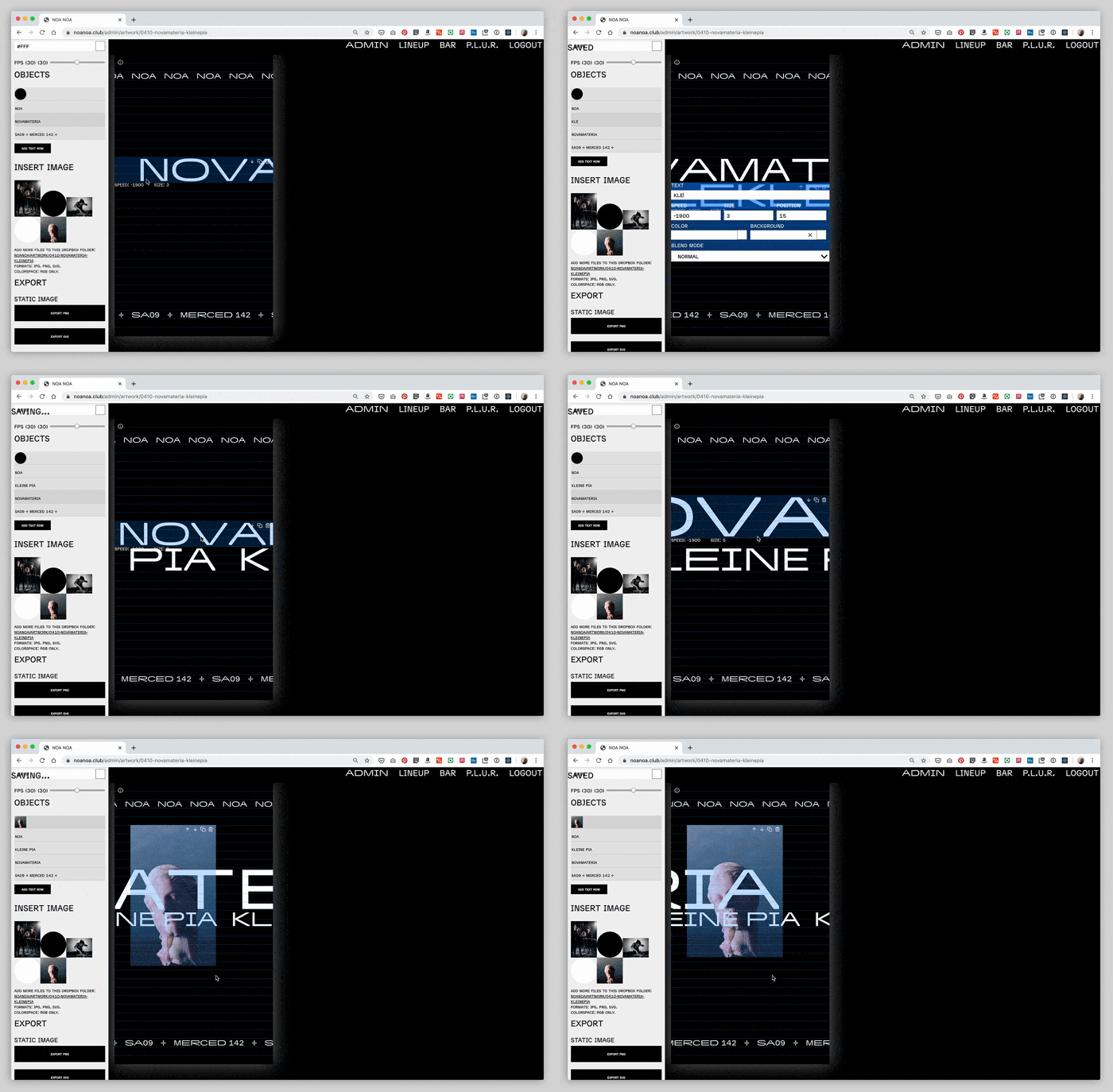
“One idea we have been interested in lately is the use of custom tools that go hand in hand with the creation of identity systems,” explains Martín Bravo, founder of Design Systems International, a technical design studio that operates in the intersection of design and software.
“These tools have the potential of augmenting the design process by automating some aspects while keeping others open to the creativity of the designers. This combined approach has the double benefit of releasing designers from the burden of keeping track of guidelines, freeing time and energy for them to focus on the creative aspects, and also for us to design systems that wouldn’t be possible to execute with traditional tools.”
This combined approach has the double benefit of releasing designers from the burden of keeping track of guidelines, freeing time and energy for them to focus on the creative aspects.
Martín and his business partner Rune Madsen, author of the free-to-read digital book Programming Design Systems, point out that not everything has to be created with tools like Photoshop, InDesign, or Figma. Instead, we can design workflows that combine traditional tools with custom, project-specific ones, enabling teams to work faster and with better results.
When the duo worked on an identity project for a new electronic music venue in Santiago, Chile, for example, they built a custom generator for the marketing team to quickly design promotional assets that use their new brand system. It maintains consistency across all applications and eases the load of the designers to focus on the creative aspects of the brand.
2. Speculative design
For Simon Collison, designer and director of future-focused digital design conference New Adventures, the web no longer feels like an open space for bold visual and interactive creativity. He’s therefore moving beyond his comfort zone toward speculative design and the topics that inform futures thinking.
“This interest has rewarded me with a belief that if design is willing to evolve responsibly, it has much to offer the future,” he explains. “Speculative design is imaginative research, an opportunity to devise hypothetical disruptions and what-ifs where we find new signals and fresh narratives. If the future is uncertain, then we must speculate.”
To Simon, this approach feels open-minded. “In place of web design’s current obsession with self-serving design systems, speculative design looks outwards in search of systems for living. The work is innovative and pioneering but also inclusive—practitioners are eager to listen to and learn from those that might benefit or suffer from new technologies. I recently attended a futures-focused conference in Madrid, and most speakers leaned on case studies involving ordinary people and diverse communities. Here is a more ethical and inclusive path into uncertainty; purpose-led projects that might mitigate harm and improve lives.”
Here is a more ethical and inclusive path into uncertainty; purpose-led projects that might mitigate harm and improve lives.
Simon acknowledges that there is legitimate concern in the field, as more designers wade in and potentially “gentrify” speculative design, that it be misunderstood and cheapened, packaged and commodified like Design Thinking. But as a former artist, he’s drawn to this multi-disciplinary practice.
“It affords a new open-ended space for digital and data practitioners to collaborate with artists, architects, writers, actors, and so on,” he explains. “This breeds prototypes for new experiences that inform valuable conversations where everyone is a stakeholder, not least those who will use or be affected by new technologies. Here is inclusive innovation that catches problems early, highlighting unintended consequences before they cause harm. This is how we put ethics into practice, and if carried out carefully this work may just change the world for the better.”
The project in the video below, which envisions a smart charging station for electric cars, illustrates why speculative work is useful for mitigating harm and implementing ethics early:
3. Machine learning in the browser
There has been a lot of hype around machine learning in 2019, and slowly but steadily it’s also entering the world of front end development. Eleanor Haproff, a developer and machine learning enthusiast, notes how libraries such as TensorFlow.js and Brain.js have made running machine learning in the browser a reality. You can now train a model, retrain an existing model, or run a pre-trained model directly in the browser.
“The browser is a great place to use machine learning,” she finds. “It’s so easy to access, works on all devices, and is highly interactive with access to the camera, microphone, GPS, text, mouse inputs, and more. Data from these inputs can be run through a machine learning model to enhance applications and add new features.”
The site aijs.rocks, built by Eleanor together with Asim Hussain and Osama Jandali, showcases a number of fun and creative apps, which run machine learning in the browser such as Deep Drum to generate continuous drum patterns, and Teachable Machine, where you can teach a machine to recognize images and play sounds.
As well as the highly distributed, highly interactive nature of the browser, running machine learning client-side has additional benefits.
“It’s less work for the application developers as they don’t have to handle user data processing,” Eleanor points out. “For example, this explicit content-checking app reviews content directly on a user’s device. Also, not sending user data server-side has major implications for privacy, which is particularly relevant for processing sensitive data such as in health-focused applications.”
Also, not sending user data server-side has major implications for privacy, which is particularly relevant for processing sensitive data such as in health-focused applications.
Eleanor recommends exploring a number of pre-trained models that are available via TensorFlow.js and can be loaded via a CDN. Also check out her CodePen, which passes data from a device’s camera to an image detection model called ‘MobileNet’ and outputs what it can recognize:
See the Pen MobileNet & TensorFlow.js by Eleanor (@ellehap) on CodePen.
4. Make websites respond to the user’s situation
We can soon build a website that will react and respond based on a user’s device, environment, or input, whether it’s for fun or to improve usability and accessibility.
Front end developer Mandy Michael has been experimenting with a range of new sensor APIs, which enable us to create new, useful, and exciting experiences on the web by taking advantage of features like device orientation and speech recognition. Her favorite is Ambient Light Sensor (currently supported in Google Chrome behind a flag), and she predicts that in 2020 we will see it used more.
“Ambient light sensors can be found in all sorts of devices like mobile phones, laptops, and TVs,” Mandy explains. “It’s used to sense the amount of ambient light in the room. A common use case is dimming the screen brightness in low-light environments to reduce the strain on your eyes.”
To get started, Mandy advises to first create a new instance, which will give us access to the `AmbientLightSensor` object, before using the `onReading` event handler to take a reading from the sensors `illuminance` property. For example:
The API can also be used to create more immersive and engaging storytelling on the web, depending on the current light level of the room the user is in. Or you could improve the legibility of text in low-light. In the example below, the font weight is changed based on the amount of light detected, using variable fonts.
5. Design for sustainability
Sustainable UX and design were first featured on our list a couple of years ago, but since then it’s gathered momentum, partly thanks to movements like Extinction Rebellion.
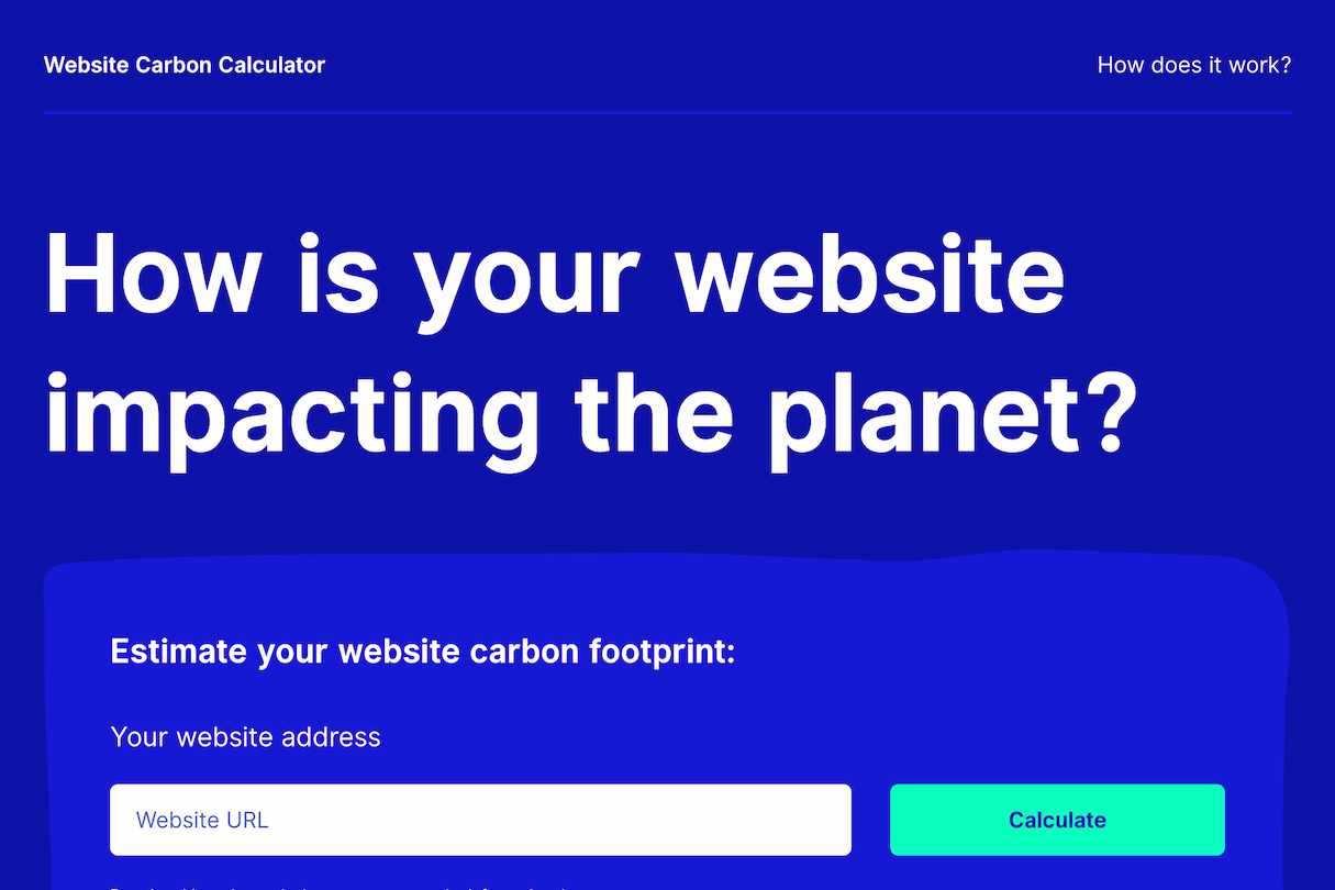
“Over the last year, it seems like public engagement with climate change has finally become much more widespread, and most industries now seem to be taking steps to mitigate catastrophic impacts,” finds Jerome Toole, senior developer at WordPress agency Wholegrain Digital and contributor to the Sustainable Web Manifesto.
“Makers of the web are also realizing that they are holding the reins of a growing, energy-hungry industry. Forecasters predict that information and communications technology may account for between eight and 21 percent of energy consumption by 2030, so anyone who delivers web products has a responsibility to consider energy use in their design and implementation.”
Anyone who delivers web products has a responsibility to consider energy use in their design and implementation.
Jerome cautions that the biggest culprits for runaway data transfer are oversized and uncompressed images, bloated external scripts, and autoplaying video. From both a UX and environmental point of view, using lazy loading is vital if you have lots of assets on a page. And on the backend, caching can hugely reduce the server load.”
The next big challenge, Jerome points out, is to make more clients aware of the issue, so that they request low carbon websites from their developers and renewable energy sources from their hosting providers.
You might also like: Sustainable UX: How Designers Can Help Make a Positive Impact on the Environment.
6. Design for immediacy and the rise of user research
We live in a world full of distractions, and a never-ending stream of sites and apps compete for our attention. Learning to grab and hold that attention, and maximize the time users will spend on our digital products, is becoming more and more difficult, but more and more important in the best website design.
In 2020, web designers need to address the immediate needs of users in the context of when these needs occur,” advises UX researcher Victor Yocco, author of Design for the Mind. “I see this happening in a few ways. First, using location or other contextual data to surface experiences relevant to what is taking place to the user. Second, an increase in offering services across industries in a consolidated experience. There will be a bigger focus on user research in order to effectively design for immediacy.”
In 2020, web designers need to address the immediate needs of users in the context of when these needs occur
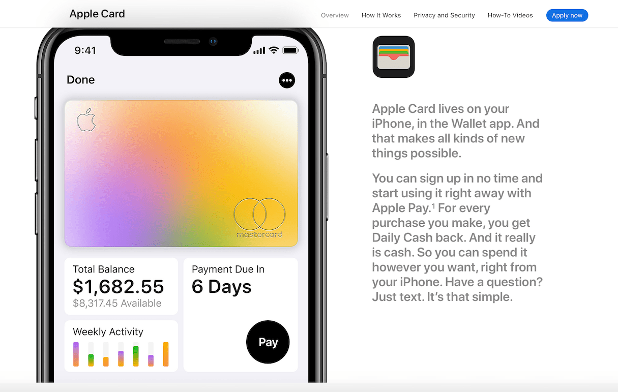
By way of example, Victor points to some of the bigger launches of 2019 where mega companies began offering additional services: Apple with credit and banking, Google partnering in healthcare, and Facebook bringing its dating offering to the US market. These companies have explored new areas to design for because they see the opportunity in presenting users with a product or service at the time of need.
Victor predicts more of these cross-service partnerships and opportunities in 2020—think banks and jobs, real estate search engines and mortgage lenders, dating apps and restaurant reservation systems.
“The key will be how these experiences play out in real time with users,” he believes. “Are they seamless? Are they delivered at the right time? To know this, we will see the continued expansion of what I feel is critical user research. Analytics can tell us part of the story through use, conversion, dropping, and basic page stats. Qualitative research is still needed to tell us the stories of how our users need our product. Or, if they do at all.”
And so, 2020 will be a big year for user research. Companies big and small will embrace the role of dedicated researchers to provide a justifiable return on investment.
7. Accessibility goes mainstream
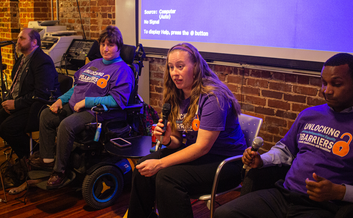
Making the web accessible to people with disabilities has been on the uptick for a couple of years, but it’s poised for a major breakout in 2020, predicts Dean Schuster, user experience design strategist and principal at user experience and web design agency truematter.
“In 2019, the United States Supreme Court upheld the notion that all sites conform to the W3C’s Web Content Accessibility Guidelines (WCAG) AA standard,” Dean points out. “This means sites must be made usable to everyone.”
Sites must now work properly for those who use screen readers or those who can’t easily use a mouse. Building to the WCAG AA standard requires testing against the specification, but it also requires finesse and understanding. Just because a site meets the specification doesn’t mean it is easy to use for a low-vision or physically impaired person. As always, Dean recommends, it’s best to test work with real users, in this case people with disabilities.
“It’s high time for web designers and developers to make sites truly usable,” he advises. “And in the US it’s no longer an option, it’s a legal requirement. This means web professionals must become accessibility experts as well. This transition has already begun and will accelerate in 2020.”
It’s high time for web designers and developers to make sites truly usable.
You might also like: Universal Design: 11 Practical Tips to Make Your Sites and Apps More Accessible.
8. Design with cognitive differences in mind
Accessibility and inclusive design increasingly also focus on neurodiversity and cognitive disabilities. Design in theses areas can be hard as disabilities—even though very common—are more hidden and needs more difficult to understand. However, when you design products for immediacy (see above) and short attention spans, you also improve the user experience for people with conditions such as ADHD. So in 2020, we will take into account users’ emotions more to improve experiences for as many people as possible.
“How people feel in anticipation of doing something or how they feel as they do it affects how we design interactions,” explains UX and sensory design consultant Alastair Somerville. “Emotions are core to meaning making and action taking. The key problem is when they constrict user cognition: what may seem obvious becomes unthinkable as memories and mental models become inaccessible in the moment of interaction.”
How people feel in anticipation of doing something or how they feel as they do it affects how we design interactions.
Alastair recommends providing clear direction in interaction design and information architecture, as ambiguity and over-choice can create stress.
“Help users form questions to ask themselves about what they want to do,” he advises. “Ensure emotion-inducing notifications have clear actions to take. Don’t grab attention without providing the next step.”
Other tips to make information more accessible for people with ADHD include highlighting important content by adding text labels to icons on hover, wrapping text instead of truncating it, using motion to enhance understanding and letting people customize the experience themselves.
Watch Elizabeth Schafer’s talk on this topic from Inclusive Design 24:
9. Privacy protection
Protecting privacy is critical to establish trust across an increasingly distrustful and volatile web, believes Chris Shiflett, founder of web design and technology studio Faculty.
“While large tech companies have been abusing privacy for some time now, we’re reaching a critical mass of concern as consumers are getting smarter and warier,” he finds. “In terms of solutions, GDPR was a good start but there’s still a lot of work to do.”
In terms of solutions, GDPR was a good start but there’s still a lot of work to do.
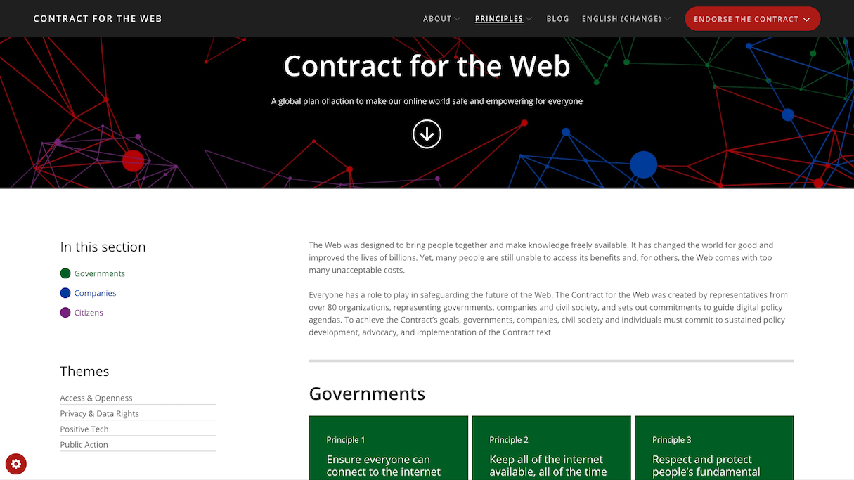
Chris recommends checking out the Contract for the Web, in which Tim Berners-Lee, the founder of the world wide web, created frameworks to help governments and companies respect and protect people’s privacy and data online. Another framework worth consulting is Privacy by Design, originally drawn up in the 1990s.
“As creators of the internet, we should use guides like these to inform our own projects,” Chris says. “There’s a growing handful of promising tools to help us do so, from Fathom Analytics to Commento.”
Chris’s studio Faculty has also created a document outlining the standards of good work for those who build for the web.
As consumers, on the other hand, Chris recommends using and supporting privacy-focused tools like Firefox (including its multi-account Containers), Keybase, and Privacy Not Included, a guide by Mozilla to safe, internet-connected products.
You might also like: 10 Ways to Establish Trust on Ecommerce Sites and Apps.
10. Less JavaScript
On our 2017 list we predicted ‘even more JavaScript,’ and indeed JavaScript is everywhere now. It creates rich, interactive experiences and powers entire web applications. There is a growing movement to use JavaScript more responsibly, however, only when it’s necessary, as it impacts performance.
“Your inbox is loaded with vendors touting products that use JavaScript solutions to monitor, personalize, and test your content options,” explains technical SEO consultant Jamie Alberico. “I’ve worked with well-established sites that purchased every cutting-edge bell and game-changing whistle out there. All those gadgets couldn’t fix the problem: the decadence of JavaScript.”
Jamie points out that JavaScript is the most expensive resource on your site and likens relying on effective client-side execution of JavaScript features with putting your decadence on the user’s tab.
“Impolite guests are quickly wearing out their welcome,” she warns. “We are guests invited to a user’s device, and there’s no guarantee for a second invitation. Sites that rely on delivering a fast user-focused experience will usurp the sluggish but well-established.”
Sites that rely on delivering a fast user-focused experience will usurp the sluggish.
Jamie thinks that some sites will blame JavaScript as the root of all evil but that trying to rip JavaScript out will likely be “a comedy of errors,” and probably not make it to production until 2021. Others sites will double down and add even more monitoring and testing JavaScript to their sites.
“The big winners of 2020 design will be those that prioritize answering user-intent,” Jamie predicts. “We can achieve this goal by loading what matters when it matters.”
Watch Stuart Langridge’s talk on how you maybe shouldn't rely on JavaScript as much as you're told to:
11. Static sites
The JAMstack (which stands for JavaScript, APIs, and Markup) is a hot topic right now. But isn’t it just a fancy term for static sites?
“Static sites sound like we are going back in time and building simple sites that can’t have anything dynamic,” acknowledges Debbie O’Brien, front end tech lead at Patterson Agency and teacher at Vue School. “But static is the new dynamic. Thanks to frameworks like Nuxt, Gridsome, Next, Gatsby, Eleventy, etc we can develop as if we were building single page applications, but actually generate the pages as static pages.”
Debbie explains that APIs play a key role for dynamic content. They enable us to add anything from authentication to payment methods and even call headless CMSs (see below), which makes static sites just as dynamic as single page applications.
“This means we get the best of both worlds,” Debbie explains. “We get interactivity and dynamic sites plus great performance, especially as static sites can be hosted on static hosting services such as Netlify and Vercel. Oh, and did I mention the cost benefits? Hosting static sites is free as you don’t need a server!”
Oh, and did I mention the cost benefits? Hosting static sites is free as you don’t need a server!
Debbie believes that the JAMstack is the key to more performant sites, and points out that even Google Chrome is investing time and money to ensure that static site generators are here to stay.
Watch Debbie’s talk on static sites from JAMstack Conf San Francisco:
You might also like: How to Build Fast and Secure Websites With the JAMstack.
12. Headless architecture
Related to the JAMstack is headless architecture, the idea of decoupling the front end presentation layer from the backend data layer of your site. This means that content is delivered from a database through a web service or API to whichever front end framework you like.
“The headless approach is becoming more popular because monolith solutions provide less control over the source code and technical roadmap,” explains Heidi Olsen, a senior front end engineer at startup Bumped, where she is helping build a design system to bridge the gap between native and DOM. “This can have implications on finding technical resources to support the platform long-term. Monolith solutions also often use resource-intensive plugins and unoptimized scripts, which has implications on page load and site speed.”
Beyond having complete control over the way you build your site, you also have the ability to serve your content across multiple channels from one data source. Heidi points out that these channels can include your website, blog, email, push, SMS, and even a mobile app. This can help mitigate inconsistencies in content and help make localizing content for the global market a smaller lift.
“Should you choose to decouple your web application and take a headless commerce approach, you need to start with what you want to say instead of how you want to present it,” Heidi recommends. “Ask who is your audience, what content do they need, and which channels can you reach them on. This will help inform which services you need, so you can build a stable, scalable backend.”
Should you choose to decouple your web application and take a headless approach, you need to start with what you want to say instead of how you want to present it.
Watch Heidi’s talk on headless architecture and the future of websites from WebCamp Zagreb:
13. Interaction with big tech
The timeline of web design as presented in Rob Ford’s book Web Design: The Evolution of the Digital World 1990–Today culminates in the need to consider what best web design actually means in 2020. Rob found that a huge majority of websites employ a template style, as befits a needs-driven world where people expect access to information in quick and recognizable formats.
“In some ways, Instagram is the modern day website and all that's needed for many,” he points out. “However, we are definitely seeing a return of the cutting edge microsite. But the next big trend continues to be not on the desktop, and not on mobile devices either, but in the human interaction with big tech: whether that be a huge installation, an escape room, or an AR world.”
But the next big trend continues to be not on the desktop, and not on mobile devices either, but in the human interaction with big tech: whether that be a huge installation, an escape room, or an AR world.
Rob believes that brands don’t see the need to create cool websites anymore, as that’s happening elsewhere, so he fears that the website will remain cookie cutter for many years, with some tiny niche audiences benefiting from the occasional cool web experience every now and then.

What’s next for the web?
As the web matures, we as designers and developers must become more responsible in its use. Trends aren’t just about the latest frameworks or immersive 3D experiences that only privileged users can access. It’s about how trends fit in the overall picture, and how we can improve the experience for as many users—as diverse as they may be—as possible. This article has shown some exciting trends in automation, machine learning, inclusive design, and user research, as well as methodologies like speculative design that go beyond fleeting visual design trends. Let’s hope at least some of these trends will make an impact over the next 12 months, so that we can build the web that we want.
Happy New Year 2020!
Our 2019 predictions
In 2019, we thought web design would see an increase in the use of ambient design, better authentication patterns, and much more. Here are our 2019 predications, unedited from when we first published them last January.
1. Intrinsic web design
The term "Intrinsic Web Design" was coined by Mozilla designer advocate Jen Simmons last year, and it’s something we will hear a lot more about in 2019.
Self-taught designer and developer Chen Hui Jing thinks it’s a very apt term.
“The word ‘intrinsic’ is defined as ‘belonging to the essential nature or constitution of a thing,’” she explains. “When we talk about the web as a visual medium, the canvas is the browser. Browser capabilities have reached a point where we can do a lot of creative things, using the tools and properties the way they were meant to be used—instead of hacks and workarounds to overcome the limitations of the browsers.”
Hui Jing encourages developers to try out this comprehensive new suite of web layout tools, including Flexbox, Grid, and Box alignment, which gives us fine-grained control of where we want to place our items if we require, but also allows us to cede control to the browser to lay out our items for us.
It was through experimentation that Hui Jing figured out a lot of the techniques herself. For example, one key thing that she highlights when teaching Grid these days is that we are now able to vary the rate of expansion and contraction of items with the various sizing values Grid offers.
See the Pen Rate of size changing by Chen Hui Jing (@huijing) on CodePen.
“Such behavior gives web designers and developers better options and greater flexibility in terms of art direction, and ensures that the focus of the content is never lost regardless of the context in which it is viewed,” Hui Jing points out. “With more developers and designers using these new tools, we'll have a greater pool of ideas and inspiration for building designs that truly suit the nature of the web.”
Watch Jen Simmons’ presentation, Everything You Know About Web Design Just Changed:
2. CSS variables and Houdini
In 2019, we will also see a more widespread use of CSS custom properties, also known as CSS variables, as more people will become aware of what they can do.
“The use of Sass and other preprocessors will start tailing off soon as the capabilities of native CSS increase,” thinks Michelle Barker, a front end developer at food and drink ordering app Ordoo, who runs CSS {In Real Life}. “Variables are a big step towards that—although to predict the demise of preprocessors for 2019 feels a bit premature!”
Use cases include theming (which can become very efficient with CSS variables) and changing property values for different breakpoints. When you use variables with CSS Grid, for example, you can easily adjust your layouts (eg the number of columns and gutters) at different breakpoints with very little code. Browser support for both Grid and variables is pretty much level, so it makes sense to use variables where you’re using Grid, and provide sensible fallbacks for older browsers.
“CSS variables can be especially useful in CSS functions,” Michelle suggests. “A great example is how Ana Tudor has used them with conic-gradient() to create an interactive pie chart. I think we’ll see many more creative examples in 2019. I also have high hopes for CSS environment variables (or global variables)—although still in working draft, the spec is already gaining browser support. Being able to use these in combination with CSS variables will mean we have a lot more power at our fingertips.”
These new effects are made possible by Houdini, a new set of APIs that will give developers the power to extend CSS and hook into the styling and layout process of a browser’s rendering engine.
“It means we can create really high performance animations and interactions without worrying about needing polyfils,” explains Mustafa Kurtuldu, design advocate at Google.
Watch The State of Houdini, a talk Mustafa’s colleague Surma gave at Chrome Dev Summit in November:
3. Ambient design
Jack Koloskus, who designs and breaks the rules of graphic design at digital storytelling publication The Outline, predicts that we will see an increase in ambient aspects of websites.
“Some of this will come from changes in technological capabilities,” he explains, “but a lot of it will come from the fact that we spend such a wild amount of time looking at screens. While 10 years ago you might not have been on a website enough to notice if something changed over the course of several hours, now, if a design element changed from the afternoon into the evening, there’s a better chance you’d pick up on it.”
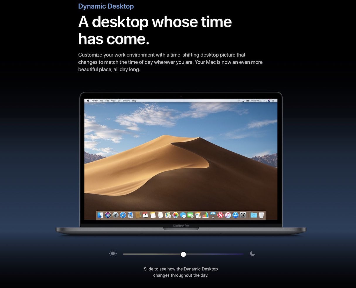
Ambient design is not new, Jack admits, but widespread usage is now becoming viable. You can, for example, change the design of a website based on the time, location, or weather. By way of an example, Jack points to Mojave, Apple’s latest operating system, which features two pre-packaged desktop backgrounds that will change based on the time of day.
“Desktop backgrounds are an obvious candidate as the persistence of the image makes the impact of the change easy to spot,” Jack suggests. “But websites allow for this approach to be taken in more dynamic ways, and also while considering user interaction. There are certainly more technological developments that will happen that we can find ambient uses for, but all of the information needed for such ambient aspects is already available to developers through the browser.”
4. Freeform design
Jack Koloskus also thinks that we will continue to see a move away from the out-of-the-can front end framework aesthetic towards more freeform design.
“The great thing about frameworks is they are fast and accessible, but their speed comes from making things visually similar,” he explains. “However, the visual literacy of the average web surfer is increasing, and they spend so much time online that it’s going to take something weird— maybe even wrong—if you want a chance of standing out at all. Perfectly adhering to design rules isn't going to keep people engaged with you. It's something more visceral than that.”
Additionally, the proliferation of free online education resources has enabled people who don’t have a classical education in web development to begin to explore the territory from their own viewpoint, which allows for much more diverse and interesting ideas to enter the field.
“It will require developers and designers to have an open mind, but there will be a lot we can learn from,” Jack predicts. “We will continue to move away from websites that are hyper-functional immutable containers of relatively unadorned information. Have a little fun, and rotate something 45 degrees!”
Marcin Treder, CEO of design tool UXPin, agrees and hopes that 2019 could be the year the over-aestheticization of web design disappears.
“The care for the experience of users has been replaced by the dominant care for certain visual styles,” he sighs. “Having your website represent flat-design, or filling it with a particular style of illustrations—all too painfully visible in the web of 2018 when everyone followed one style of illustration—became more important than a carefully crafted user experiences. The web badly needs the rebirth of the good old user-centered design.”
Oliver Williams, meanwhile, a front end developer at Springer Nature, is excited by browsers continuously improving the design experience in DevTools. “With CSS clip-path and shape-outside, we may start to see a less rectangular web,” he says.

5. The design of value
Jordan Moore, director of design at digital product studio Dawson Andrews, anticipates a move towards commercial value.
"The name of the game in digital product design isn't the design of aesthetics but the design of value,” he explains. “This is the difficult part of digital design, as it often requires thinking from principles first rather than reasoning by analogy. It's too easy to imitate aesthetics, such as concepts you see on design galleries, as they only deal with skin-deep issues by definition. As a general rule, if it's replicable, then it's a prime candidate for mass-production and an area that will doubtlessly be displaced by AI in future—the value in traditional, interface-focused fields is draining fast.”
Jordan thinks that the creation of meaningful value, on the other hand, is a field that isn't easily replicable and has fewer opportunities for algorithms and AIs to mass-produce. In 2019 he can see our industry slowly waking up to this observation.
“We'll become more comfortable deferring low-value tasks to automated tools and creating further systems beyond design and build systems to allow us to focus more of our efforts on the higher value, more cognitively intense work. Studios that recognise this will outpace everyone around them, and they'll take their lucky clients along for the ride."
6. Better authentication patterns
The last year was defined by GDPR and an ever-increasing cacophony of data breaches and trust violations from the companies which previously held the greatest sway over customers' positive perception of the web.
“As a result, in 2019 web designers must take a hard look at their authentication patterns,” warns Cheryl Platz, principal designer and owner of Ideaplatz. “Sites who previously used Facebook login for ease of use must now grapple with their first customer impression being a negative one, merely by proxy.”
“Even without Facebook Connect, all sites will face a higher burden of proof at the time of signup. What customer need are you solving when they sign up for an account? If it's not satisfying an unsatisfied need, it's folly to assume customers will be as willing to engage as they once were. Further, all designers will need to run their customer profile design through a fine-toothed comb. Do you really need your customer's gender? Age? Phone number? Every 'extra' field increases the risk for you and your customer.”
As much as Cheryl, who is most well-known for her work on the future of voice interfaces, would like to see conversational UIs making more genuine headway, she’s concerned about these trust issues threatening the foundation of the industry and cautions that they must be dealt with before returning focus to the cutting edge. “Most of the ‘cutting edge’ technologies are even more invasive of privacy, and will not succeed without a strong foundation,” she warns.
7. Recognition of bias
Content strategy consultant Rahel Bailie believes 2019 will be the first year of a multi-year effort to design for inclusivity.
“A lot of attention will be paid to systematic biases in algorithms and how design either amplifies or diminishes that bias,” she predicts. “Designing with dark patterns, for example, can capture data in a way that reinforces erroneous results. That, in turn, affects the quality of data that gets fed back into the algorithms.”
“To paraphrase Adventures in UX Design, dark patterns rob users of their agency. Instead of reducing all users outside of the mainstream as edge cases, there will be a recognition that there are multiple audience segments that are all significant groups. One could say that the way network television or mainstream radio made way for streaming services with diverse audiences, each with their distinct categories, digital services will start recognizing diverse audiences and their needs. That will range from the way content is presented to the content itself.”
Watch How I’m Fighting Bias in Algorithms, a talk by Joy Buolamwini, a computer scientist and digital activist based at the MIT Media Lab, who founded the Algorithmic Justice League:
8. Inclusivity through omni-channel content
Rahel Bailie also believes that inclusivity through content being delivered in an omnichannel context is going to pick up steam in 2019. The idea is that by understanding context (for example, when you know the stage that a customer is at on their journey, or the demographic of your audience), it's possible to deliver more appropriate content.
“It's been a long time coming, but with a better understanding of how to be inclusive through personalization and better tools, it's easier to be inclusive of diverse audiences,” she explains.
Technical communicators have used component content management systems with XML editing interfaces to do sophisticated omnichannel content for some time now, Rahel acknowledges, but it has been within a closed ecosystem of properly structured, semantic content. In the messier world of marketing content, the appetite to enforce structure on content and workflows and to learn sophisticated editing interfaces has been far less pressing. Instead, the onus has been put on technology to compensate.
“I think 2019 will be the tip of the iceberg, but as more machine learning and artificial intelligence is incorporated into delivering content through bots and voice interfaces, web design will need to change to accommodate the variety of content that could be delivered. The algorithms may deliver text-based or visual content that comes from a range of sources and formats, and in varying lengths and quality.”
Rahel reckons that there will be an adjustment period and that accommodating those audiences can result in a bit of anxiety until we figure out how to work with all the variations.
“In 2019, progress may be relatively superficial,” she says, “but this will be the year that lays the groundwork for more advanced ways to implement measures for inclusivity.”
9. DesignOps
Over the past few years we’ve seen a move away from agencies towards in-house teams. Andy Budd, founder and chief executive of strategic design consultancy Clearleft, believes this happened because, as reliance on digital grew, companies needed to grow the internal capability to move faster and capture more value at a reduced cost.
“The big tech companies decided to kick-start their design function by acquiring a few well-known agencies,” he explains. “These acquisitions brought in new management skills, and resulted in the emergent field of DesignOps — or Design Operations. One of the first aspects of DesignOps to gain popular traction was the creation of design systems. However, it turns out that while it’s relatively easy to scale technology teams, scaling design inside traditional companies is a lot harder.”
As internal design teams grow from five to 20 to 50 or more, Andy thinks other processes and techniques are needed to keep design teams productive and prevent things from grinding to a halt. Also, outside a few large tech companies, DesignOps hasn’t been practiced widely or especially well so far. Andy reckons that’s going to change over the course of the next couple of years and that companies will be looking for external agencies for help.
Related to this is the diversification of teams.
“Putting a bunch of privileged young adults of the same gender, interests, and social leanings together in a room to bring a business idea to fruition is bound to happen,” acknowledges Rahel Bailie. “But as their business matures, the bumpy awakening to the need for inclusivity leads to an aha moment. And that is leading to the realization that inclusivity means building a team with diversity built in, and that means not only races and genders, but also ages and life circumstances.”
10. Purposeful storytelling
Over the years storytelling has influenced and driven innovation in both science and technology. Sherlock Holmes had an effect on how crimes were being solved, while Star Trek provided inspiration for Amazon’s Alexa.
UX designer Anna Dahlström, who’s writing a book about Storytelling in Design, thinks that in 2019 we will increasingly need to turn to traditional storytelling to connect with audiences, as the context that products are used in is becoming more complex.
“As designers, we need to master Walt Disney’s skill of being able to get both the bigger picture and the small details right,” she advises. “We also need to account for a growing number of eventualities and moving parts that need to be defined and designed, so that it all comes together. Just like a good story.”
Anna suggests learning from character development to help us identify and define all the actors that play a part in a product, narrative structures that take into account happy and unhappy users, and set and scene design that helps us get particular parts of a product experience to come to life.
“All of this helps ensure that the heroes are the users of the products and services we’re working on, and that they’re who the experience is about.”
Haraldur Thorleifsson, founder and CEO of full-service creative agency Ueno, agrees.
“Designers are translators between the needs of the business and the needs of the end user,” he points out. “I would love it if web design was more about purposeful storytelling, about making the user feel something unique and universal. We need to remember that we as designers are responsible for the moment that our users interact with the thing that we created. And since time is the ultimate limited resource, it’s our responsibility to make that moment meaningful.”
11. Smart offices
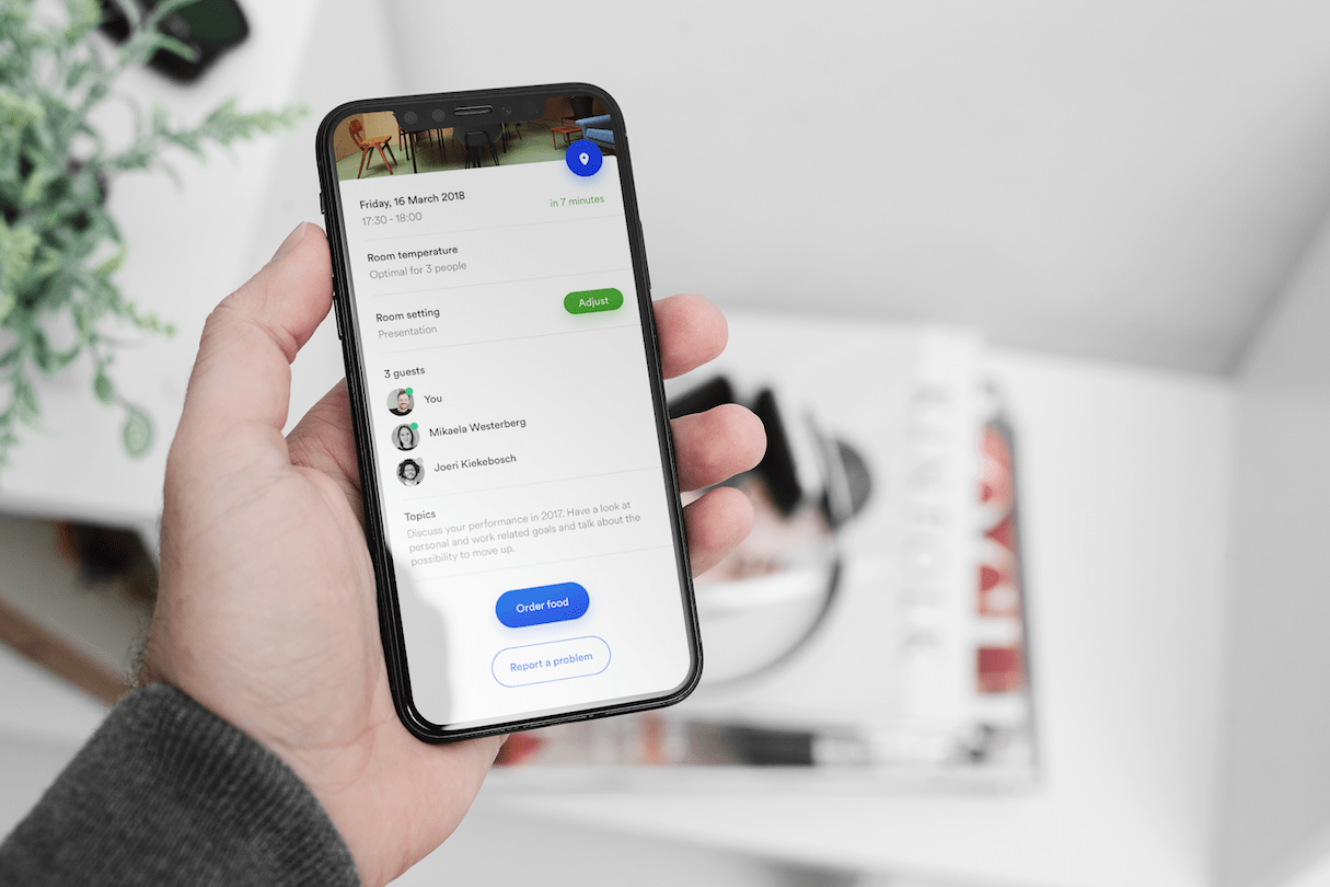
David Vogel, experience design director at global creative agency AKQA, believes that in 2019 we will combine the Internet of Things, edge computing, voice interactions, smart lighting, and multi-sensors with self-learning systems to create smart office environments that identify occupants and create a bespoke workplace experience for them based on their individual preferences.
“Our relationship with digital used to be a relationship with another world, accessed through an interface like a PC, tablet, or phone,” he explains. “Now, our relationship with the real world is enhanced and augmented using digital technology. Our habits and behaviors allow our environment to adapt to our needs, to orchestrate serendipitous encounters between people with compatible skills and interests, and to reduce workplace friction and allow for greater personal productivity.”
David believes this will not only benefit the health, wellbeing, collaboration, and sense of achievement for employees, but will also contribute to the bottom line of forward-looking businesses that will make smarter and more efficient use of space, energy, and talent.
12. Progressive web apps
Google design advocate Mustafa Kurtuldu anticipates that progressive web apps, although having been around for a while, will make a big impact this year.
“We have seen multiple books published on PWAs, especially Progressive Web Apps by Jason Grigsby,” Mustafa explains. “A Book Apart has consistently had their finger on the pulse of digital design, so that shows a big sea change from a designer’s perspective. Understanding how PWAs are designed means thinking about user states for offline, online, and li-fi.”
Google has just launched progressive web app squoosh.app, a tool that lets you drag and drop an image to your browser, compress it using various settings, compare the original with the new version, and then download it. Squoosh is open source, so others can learn how to implement the design patterns as well.
For more on progressive web apps, download the free ebook Progressive Web Apps: The Future of the Mobile Web, a collaboration between Google, Microsoft, and Awwwards.com.
Bonus: Fewer loading spinners!
To finish off, here’s our pet hate of 2018. But there’s good news! Front end developer Oliver Williams hopes that this will be the year we start to see fewer loading spinners due to the introduction of suspense in the React framework.
“We’ll see a lot of sites using this feature to handle perceived performance,” he predicts. “Think Medium’s progressive image loading. It’s like progressive JPEGs all over again!”

Read more
- Top Ecommerce Web Design Trends for March
- Using Humor in Design: Why, When, and How
- Top Ecommerce Resources for August
- Free Webinar] Dirty Little Tricks From the Dark Corners of Front-End
- Top Ecommerce Resources for October
- 8 Best Practices for Designing an Ecommerce Site that Converts
- 5 Questions You Should Ask Your Clients Before Every Web Design Project
- Top Ecommerce Web Design Trends from January
What are the web design trends that you think will make an impact in 2020? Let us know in the comments section below.

